
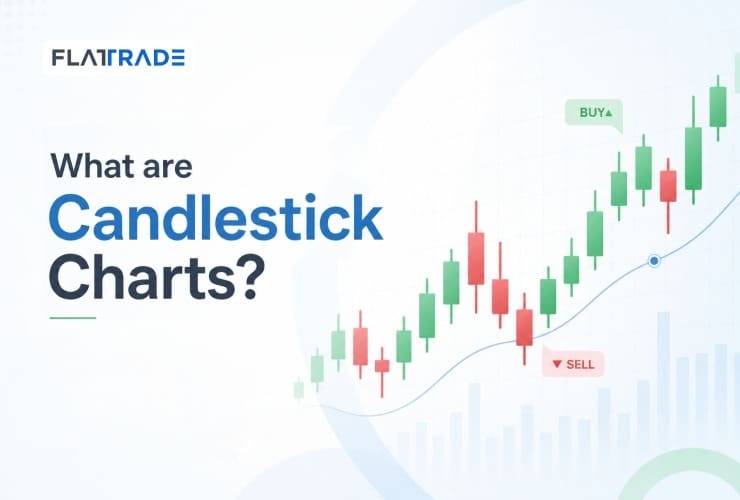
Candlestick charts are a graphical representation of price movements of a security based on a timeframe. This timeframe can be 1 minute, 2 minutes, 1 day, 1 week, 1 month, etc. So if you select 1 day as the time frame, then one candlestick represent the open price, high price, low price and close price of a security in one day. If you change the timeframe to 1 week, then the price movement that happened in one week is represented in one candlestick.
Candlestick gives a lot of information about investors’ or traders’ sentiments on the price of a security and are used by analysts to determine the entry or exit of a trade. This Candlestick charting dates back to the 1700s in Japan and the technique was used to track the price of rice. You can use Candlesticks to analyse the price for various financial asset such as stocks, ETFs, foreign exchange, commodities and derivatives like futures.
For better understanding and to avoid confusion, let us select a daily or 1 day timeframe. So one candlestick will represent the price fluctuation in one day.
A candlestick will have a body and a wick or shadow. The body part of the candlestick will be long and wide, and its colour can be green or red. A few people prefer to change the colour of the candlestick but most trading softwares follow this colour code as default.
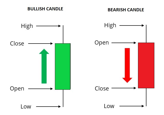
A green body shows that the closing price was higher than opening price. Green Candlestick also says there has been buying pressure during the day.
A red body says the closing price was lower than opening price. Red Candlestick also says there has been selling pressure during the day.
Moreover, if open and close price are closer then the body will be small. It implies that neither the buyers or sellers are in a dominant position and it is a sign of indecision among traders/investors. If the open and close price are far apart, the body will be long.
A wick or shadow is a line that can be found above and below the body. The wick represents the highest and lowest price of a security on that day. If the wicks are really long than the body, then it can interpreted as the day had been a volatile day. It says that there had been huge swings between prices on that day.
The above image shows a single Candlestick. A group of two or more Candlestick will form a pattern which will give more information about the price and also likely trend direction of the security’s price.
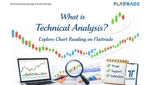
To read more articles on technical analysis, click here