
In capital markets, moving average (MA) is one of the most widely used technical indicators and also a simple indicator which many traders and investors rely upon to make decisions.
As the name suggests, moving average is just the average of closing prices or opening prices of a security over a given period of time. While calculating moving average, old data point is dropped and new data is considered. For example, if it is a 5-day moving average, then the 5 immediate data points (closing or opening prices) from the past 5 days are taken into account for calculations.
The security can be a stock, commodities like crude oil, gold, silver, platinum, etc. Moving averages are also used to determine the trend of indices like Nifty 50 or Sensex. You can also use moving average to assess the trend of ETFs like NiftyBees, Kotak Nifty ETF, etc.
Since moving averages are based on the average mean of security prices for the past 5 days or 10 days or any other time period, this indicator smoothens the price data. So this gives a line which is in uptrend or downtrend. If the number of days is longer, then the lag will be higher compared to the prices indicated by a candle stick. If the number of days are shorter, the moving average line will be closer to original prices represented by a candle stick.
Moving average is a lagging indicator because the calculation is based on past prices. It also filters out noise or volatility in the market. Though lagging indicators like moving average give traders delayed results and a late entry into the trade, it gives more assurance to the traders about the price trend before they enter a trade that is in a uptrend or downtrend.
Moving average line can also be used as a support and resistance line. If the security’s price is trading above the moving average line, then the price is likely in an uptrend and the line acts a support line. If the price is below the MA line, then prices is probably in a downtrend and acts as a resistance line.
Technical Chart of Tata Motors
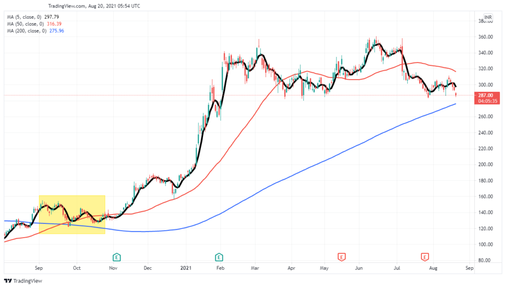
Let’s take Tata Motors as an example to understand moving average. The above image shows Tata Motors on a daily time frame, i.e., each candle stick represents the open, high, low and closing price of the share in a single day. We can also select 1 minute, 2 minute, 1 week or 1 month as time frames.
I have taken the most widely used moving average length to showcase the differences. Here, length is nothing but the number of days we would like the moving average line to represent. The black line on the image shows 5-day moving average, red line shows 50-day moving average and blue line shows 200-day moving average.
From the image, it is clear that 5-day moving average is closer to candle sticks and imitates the original price. The longer moving average lines 50-day and 200-days lines are farther from the original prices and gives slow or delayed signal with respect to the trend direction.
To read more technical analysis, click here